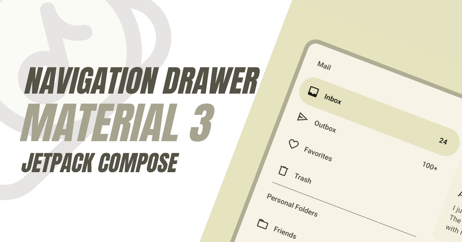
In this article, we will discuss how to implement a navigation drawer in Material 3 using Jetpack Compose. The navigation drawer is a common UI pattern in Android applications, allowing users to navigate between different screens or destinations in the app.
Material 3 has introduced a new way to implement the navigation drawer as a standalone component, separate from the Scaffold composable. This change provides more flexibility and control over the design and behavior of the navigation drawer
To implement a navigation drawer in Material 3, you can use the ModalNavigationDrawer composable. This composable takes a drawerState and a drawerContent as parameters. The drawerState is a rememberDrawerState that keeps track of whether the drawer is open or closed. The drawerContent is a composable function that defines the content of the drawer.
Here is a sample code snippet that demonstrates how to use ModalNavigationDrawer:
@Preview
@Composable
fun ModalNavigationDrawerSample() {
   val drawerState = rememberDrawerState(DrawerValue.Closed)
   val scope = rememberCoroutineScope()
   // icons to mimic drawer destinations
   val items = listOf(Icons.Default.Favorite, Icons.Default.Face, Icons.Default.Email)
   val selectedItem = remember { mutableStateOf(items[0]) }
   ModalNavigationDrawer(
       drawerState = drawerState,
       drawerContent = {
           ModalDrawerSheet {
               Spacer(Modifier.height(12.dp))
               items.forEach { item ->
                  NavigationDrawerItem(
                      icon = { Icon(item, contentDescription = null) },
                      label = { Text(item.name) },
                      selected = item == selectedItem.value,
                      onClick = {
                          scope.launch { drawerState.close() }
                          selectedItem.value = item
                      },
                      modifier = Modifier.padding(NavigationDrawerItemDefaults.ItemPadding)
                  )
               }
           }
       },
       content = {
           Column(
               modifier = Modifier
                  .fillMaxSize()
                  .padding(16.dp),
               horizontalAlignment = Alignment.CenterHorizontally
           ) {
               Text(text = if (drawerState.isClosed) ">>> Swipe >>>" else "<<< Swipe <<<")
               Spacer(Modifier.height(20.dp))
               Button(onClick = { scope.launch { drawerState.open() } }) {
                  Text("Click to open")
               }
           }
       }
   )
}
In the above code, ModalNavigationDrawer is used to create a navigation drawer. The drawerContent parameter is used to define the content of the drawer. Inside the drawerContent, a ModalDrawerSheet is used to contain the items of the drawer. Each item is a NavigationDrawerItem that displays an icon and a label. The onClick function of each item is used to close the drawer and update the selected item.
The content parameter of ModalNavigationDrawer is used to define the main content of the screen. In this case, it is a Column that displays a text and a button. The button is used to open the drawer.
Please note that the navigation drawer in Material 3 is designed to work with the NavController for navigation between different screens. You can use the NavController to navigate to the corresponding route when an item in the navigation drawer is clicked.
In conclusion, Material 3 provides a flexible and powerful way to implement a navigation drawer in Jetpack Compose. By using the ModalNavigationDrawer composable and the NavController, you can create a navigation drawer that fits the Material Design guidelines and provides a good user experience.
References are taken from : 1. proandroiddev.com 2. stackoverflow.com 3. stackoverflow.com

